My extremely chaotic journey in making the hardest part of my costume!

Showing posts with label art. Show all posts
Showing posts with label art. Show all posts
Friday, 30 October 2020
Thursday, 17 September 2020
Tuesday, 28 April 2020
Fashion and Climate Change: How the crisis of our era defines the art we wear
In art, as in life, patterns inevitably emerge. Whether we look at one artist’s work or a collection of artists, we can find trends in materials, style, or philosophical approach. Or we can zoom out even further, and look at how collective experiences in society shape artists’ work across all these factors.
For example, all of Modern Art, from abstract video art to impressionist paintings, is about questioning oppressive, long-held traditions. The clash of democracy and science against monarchy and the religious state led to a crisis which became the collective experience that shaped art across styles and media for over 100 years.
Recognizing collective experiences as they’re happening has been difficult. Historians could only do so in retrospect, because you had to work much harder to find enough art and literature to see these patterns. But that’s not true anymore. Now, we can easily access a tremendous amount of contemporary art and literature, in our pajamas, at home.
We don’t need to wait to see what our collective experience is. It’s climate change.
Climate change is the term we use to describe that our world is changing for the worse because of our actions. Humans have long praised ourselves for our ability to shape our environment (going so far as to create a major distinction in our species before and after the agricultural revolution), but we are now finally grappling with the reality of our shortsightedness, and the uncertainty of whether our actions can save us.
Art about climate change is art fueled by this uncertainty. We respond to it with a range of emotions--fear, despair, numbness, diligence, denial, even joy.
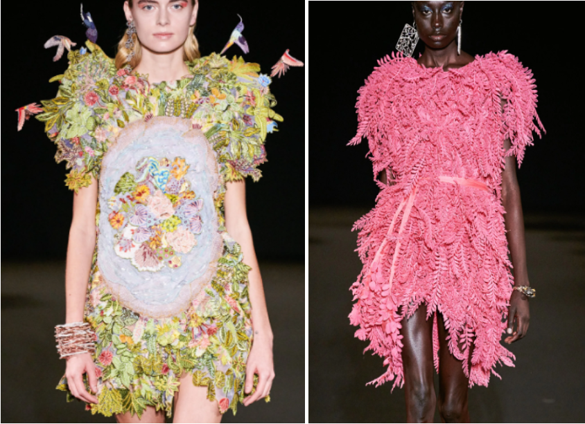
Climate change shows up in this season’s fashion collections in their floral themes. Representing flora and fauna in our clothes is a very human thing to do--almost every culture, when the tools to print or embroider are available, represents their natural surroundings on their clothes. But we are no longer just designing clothes when we feel inspired by nature, we are making clothes when we are afraid of losing it.
Some designers respond to this fear with nihilism, like Marine Serre’s Spring 2020 collection, which says “this is for when you’re fist-fighting your mom over clean water, but make it fashion.” It necessitates desensitizing yourself to this kind of future, and succumbing to fear or cynicism isn’t particularly creative. It’s stale.
Some designers respond to climate change with moral responsibility, like Mara Hoffman’s Spring 2020 collection, which uses sustainable fabrics and reuses silhouettes as a protest against fast fashion.
But because climate change is a collective experience in our era, it shows up in the work of designers who aren’t trying to respond to climate change at all.
Alexander McQueen’s Spring 2020 collection isn’t “about” climate change, it’s about ensuring you “feel wreathed in confidence” in their dresses, according to Vogue, and uses bold colors and free-moving fabric to that end.
But, in searching for floral illustrations to use in this collection, McQueen's artistic director, Sarah Burton, and her team were most interested in endangered and extinct flowering plants. They sifted through preserved floral specimens at the Royal Botanic Gardens at Kew in London, and by showcasing species that are vulnerable to ecological changes, made a statement about climate change anyway. After all, you only shine a spotlight on something you think is important.
When looking at this collection initially, I didn’t recognize that the plant species were either endangered or extinct. Perhaps I ought to. We continue to learn new reasons why biodiversity is important for all life on Earth, and I wonder whether a greater awareness about these species could save them, and us.

Givenchy’s Spring 2020 collection is a historical retrospective inspired by the gardens of Sissinghurst Castle, as well as Hubert de Givenchy’s flower-lace gowns that first put the design house on the map. Clare Waight Keller, Givenchy’s artistic director, isn’t attempting to make a statement on climate change in her work.
However, the gardens that inspired her have experienced cycles of neglect and preservation since the 1500s. Political and economic shifts in England over the last 400 years often meant that the resources in maintaining gardens weren’t always available. But, when those resources returned, people worked hard to restore these natural spaces. Givenchy’s collection affectionately highlights a very old garden, but in doing so, it also serves as a testament to the kind of diligent stewardship it takes to maintain a natural habitat well enough for future generations to enjoy.

Rahul Mishra’s Spring 2020 collection is a successful attempt at showcasing his innovative embroidery techniques. Reviews of this collection highlight his use of feather-light materials to create an increasingly impressive visual detail the closer you look.
But the representations on this garments are inspired by his four-year-old daughter’s awareness of her changing environment, in an attempt to capture it as it exists now, he tells Vogue. And his daughter’s growing understanding of her environment, like that of young people everywhere, is inextricably linked to climate change.

I search and I search and I search and every time I look, I see fashion connected to our changing environment. I see it because I, too, am part of this collective experience. When you’re designing clothes inspired by nature, you’re observing what’s there, what’s not there, and how you feel about that. You, like all of us, are grappling with the impermanence of our natural world.
And I, as your viewer, am grappling with it too. When I look at the ruzhil leaves in Rahul Mishra’s dresses, or the rutaceae flowers on Alexander McQueen gowns, I don’t know that these plants are extinct. I don’t know that Sarah Burton’s dress is an obituary. And I wonder, as we continue weaving our natural world into our garments, documenting and preserving what we see, how much more of what we create is destined to become a eulogy, and how much will become a loving testament to our hope for the future.
For example, all of Modern Art, from abstract video art to impressionist paintings, is about questioning oppressive, long-held traditions. The clash of democracy and science against monarchy and the religious state led to a crisis which became the collective experience that shaped art across styles and media for over 100 years.
Recognizing collective experiences as they’re happening has been difficult. Historians could only do so in retrospect, because you had to work much harder to find enough art and literature to see these patterns. But that’s not true anymore. Now, we can easily access a tremendous amount of contemporary art and literature, in our pajamas, at home.
We don’t need to wait to see what our collective experience is. It’s climate change.
Climate change is the term we use to describe that our world is changing for the worse because of our actions. Humans have long praised ourselves for our ability to shape our environment (going so far as to create a major distinction in our species before and after the agricultural revolution), but we are now finally grappling with the reality of our shortsightedness, and the uncertainty of whether our actions can save us.
Art about climate change is art fueled by this uncertainty. We respond to it with a range of emotions--fear, despair, numbness, diligence, denial, even joy.
Climate change shows up in this season’s fashion collections in their floral themes. Representing flora and fauna in our clothes is a very human thing to do--almost every culture, when the tools to print or embroider are available, represents their natural surroundings on their clothes. But we are no longer just designing clothes when we feel inspired by nature, we are making clothes when we are afraid of losing it.
Some designers respond to this fear with nihilism, like Marine Serre’s Spring 2020 collection, which says “this is for when you’re fist-fighting your mom over clean water, but make it fashion.” It necessitates desensitizing yourself to this kind of future, and succumbing to fear or cynicism isn’t particularly creative. It’s stale.
Some designers respond to climate change with moral responsibility, like Mara Hoffman’s Spring 2020 collection, which uses sustainable fabrics and reuses silhouettes as a protest against fast fashion.
But because climate change is a collective experience in our era, it shows up in the work of designers who aren’t trying to respond to climate change at all.
Alexander McQueen’s Spring 2020 collection isn’t “about” climate change, it’s about ensuring you “feel wreathed in confidence” in their dresses, according to Vogue, and uses bold colors and free-moving fabric to that end.
But, in searching for floral illustrations to use in this collection, McQueen's artistic director, Sarah Burton, and her team were most interested in endangered and extinct flowering plants. They sifted through preserved floral specimens at the Royal Botanic Gardens at Kew in London, and by showcasing species that are vulnerable to ecological changes, made a statement about climate change anyway. After all, you only shine a spotlight on something you think is important.
When looking at this collection initially, I didn’t recognize that the plant species were either endangered or extinct. Perhaps I ought to. We continue to learn new reasons why biodiversity is important for all life on Earth, and I wonder whether a greater awareness about these species could save them, and us.

However, the gardens that inspired her have experienced cycles of neglect and preservation since the 1500s. Political and economic shifts in England over the last 400 years often meant that the resources in maintaining gardens weren’t always available. But, when those resources returned, people worked hard to restore these natural spaces. Givenchy’s collection affectionately highlights a very old garden, but in doing so, it also serves as a testament to the kind of diligent stewardship it takes to maintain a natural habitat well enough for future generations to enjoy.

Rahul Mishra’s Spring 2020 collection is a successful attempt at showcasing his innovative embroidery techniques. Reviews of this collection highlight his use of feather-light materials to create an increasingly impressive visual detail the closer you look.
But the representations on this garments are inspired by his four-year-old daughter’s awareness of her changing environment, in an attempt to capture it as it exists now, he tells Vogue. And his daughter’s growing understanding of her environment, like that of young people everywhere, is inextricably linked to climate change.
I search and I search and I search and every time I look, I see fashion connected to our changing environment. I see it because I, too, am part of this collective experience. When you’re designing clothes inspired by nature, you’re observing what’s there, what’s not there, and how you feel about that. You, like all of us, are grappling with the impermanence of our natural world.
And I, as your viewer, am grappling with it too. When I look at the ruzhil leaves in Rahul Mishra’s dresses, or the rutaceae flowers on Alexander McQueen gowns, I don’t know that these plants are extinct. I don’t know that Sarah Burton’s dress is an obituary. And I wonder, as we continue weaving our natural world into our garments, documenting and preserving what we see, how much more of what we create is destined to become a eulogy, and how much will become a loving testament to our hope for the future.
Tuesday, 16 July 2019
Art & Psyche
“Okay since we don’t have time to see everything, let’s play a game,” I say, pulling off my jacket. “We’re going to look for art that best fits certain categories. My proposals are: most ridiculous… prettiest… and most likely to succeed.”
Connor laughs, and we step into the National Gallery. I’ve had a lot of fun in this museum, and I’m excited to share it with Connor and see how it resonates with him.
“This is ridiculous. This is absolutely ridiculous,” he says, squinting at a painting of a an imaginary ideal gallery of a collection of paintings, sculptures, and tools. I throw it in the ring for prettiest. (What? It's pretty!)

Cognoscenti in a Room hung with Pictures, by Unknown Flemish Artist, about 1620
“I want to add a category. Most contented.” Connor says.
“What does contented mean?”
“A piece of art that is most comfortable and confident.”
“Mmm, gotcha.”
Connor knows this game is helping me re-engage a dormant part of my mind, the part that notices and shares details. When we were in Brixton, I realized I had been filtering out details recently. Then, somewhere between dinner and walking a few days later, I realized it was deeper than that.
"I think this is the most contented painting I've seen so far," I declare, looking at a painting of ruins being overtaken slowly by plants, peppered with people comfortable in their tasks. I'm sure it's depicting a myth I can't identify, but that's okay. What's important is that it's making me feel relaxed by looking at it. Connor moves next to me and nods. He likes it a lot, too.

Landscape with the Rest on the Flight into Egypt, by Pierre Patel, 1652
"I want to add another category," Connor begins, "most self-serious." The painting he's pointing to looks staged. It looks like these people held this pose for a very, very long time to look very, very serious.

A Woman Playing a Lute to Two Men, by Gerard ter Boch, 1668
We laugh.
A few days ago, when Connor and I talked about how I think my detail-filter was deeper than I anticipated, I began to grapple with cognitive dissonance in a way that felt like I was loosening a ball of yarn in my brain, massaging it so I can see what's hiding inside.
Paying attention to details is something I love. It’s something I’m good at. And when I went on international trips before, I was a college student who leveraged this skill. When I became a teacher, I had to stop. I had to force myself to stop.
I had to stop paying attention to every part of a lesson plan, so I could get enough sleep at night. I had to stop paying attention to every individual thing I learned about every person I interacted with, because it overwhelmed me. I had to start practicing noticing the salient things—what are the things that have the largest impact? Notice that. Dig into that. Everything else needs to be glossed over. My work is not sustainable otherwise.
And, with practice, I became good at honing this filter. I became good at looking at huge piles of student work and noticing the most important trends. I became good at noticing the most important feedback I could share with my colleagues when I was in their classrooms. I became good at looking at lesson plans and revising the most important portions. I became good at reading hundreds of student letters every Friday and remembering what felt most important about each one.
I can tell you something about every student I have ever taught. I can tell you what they’re good at. I can tell you what their goals were when they were my student. I can tell you what many of them are up to now. I can’t tell you every single thing they’ve shared with me, but I can tell you the most important things. This filter was how I could still be the kind of teacher I want to be without being so overwhelmed that it drowns me.
But I didn’t realize that this filter started bleeding into everything else. I don't want to be like that all the time—I don’t want to listen to my close friends tell me about their day and only remember what I think is important. I want to know everything they want to share with me. I don’t want to walk in my neighborhood and only notice what helps me get around. I want to notice what’s in the cracks, I want to notice how time shifts and who occupies which spaces. There’s a joy in taking as long as you want looking at a thing and noticing what resonates with you. What surprises you. What makes you feel weird.
I haven’t felt that kind of joy in a long time. I cried when I shared this with Connor, and then we cried together.
But, now, I feel a kind of hopefulness I haven’t felt in a long time. Now that I know, I can do something about it. I don't have to wait for things to get better on their own. I feel grateful.
Connor calls me over urgently. He's gasping in the National Gallery for the first time. "Grishma... look at this."

The Adoration of the Kings, by Pieter Bruegel the Elder, 1564
"I don't get it. It just looks like a Christian painting."
"No Grishma, look closer."
"Oh, ew."

The Adoration of the Kings, by Pieter Bruegel the Elder, 1564 (Detail)
"Read the description," he urges.
"The tiny, naked Christ Child seems vulnerable among the heavily armed men. He recoils from the gift of myrrh, a spice used to prepare bodies for burial, forseeing his future death?? What??"
Connor continues where I left off: "By contrast, the spectators, one wearing glasses, are blind to what is before them, the son of God made man to redeem fallen humanity."
"Most ridiculous. Most self-serious. This is so bad. It's so good."

The Adoration of the Kings, by Pieter Bruegel the Elder, 1564 (Detail)
We laugh about this one for much longer than the other ridiculous ones.
“I’m going to add a category. Best dog," I say.
The museum closes soon, and we didn't actually decide on paintings for any of the categories, and that's okay. We found some great dogs in those last minutes.


Monday, 17 December 2018
Pantone Color of the Year & Spring 2019 Collections
When I saw Pantone's 2019 color of the year, my only reaction was to say "it's so preeeettttyyyy!" They have an environmentally-geared explanation behind their choice, but even their reasoning included "also people think this is a pretty color."
They're correct.

photo via Pantone
A few months ago, I bought curtains that happen to be in this color and I'm still exploring what this might look like on the interior front, but I wanted to share where I've seen this color (or similar) popping up on runways. Most of what I've seen from Spring 2019 shows include variations on shades of orange, not quite coral, but maybe that'll change for the Fall '19 collections. Any step away from nude, deep red, or black in winter-wear will be a much needed reprieve, so I'll take anything at this point.

Tsumori Chisato's entire Spring 2019 collection is worth sifting through. Her pieces are inspired from a cruise she took on the Nile, and while the symbolic representations of things she saw are in themselves beautiful (papyrus plants, camels, boats, pyramids, etc.), the vibrant colors and careful embroidery is what sets these apart as some really fun, visually exciting pieces.

Ashish Gupta has always been incredible at designing clothes we ought to wear while dancing—he makes them functional. (How many designers can you name that changed the shape of sequins they use so that their clothes are easier to dance in?) Designers who create clothes meant to be worn in an 'underground venue' usually end up making them look... dirty. Boring. But not Ashish Gupta. His Spring 2019 collection is edgy, fun, and most importantly, able to be danced in until you are dripping with sweat. How do we know this? Luke Leitch writes that this collection was "worn by models who had water poured over them backstage in order to look authentically sweaty."
Fuck it up, Ashish.

Vika Gazinskaya's cuts have often been androgynous, so seeing the delicate and flowy tailoring in her Spring 2019 collection caught me off guard. She hasn't strayed too far though, because the pieces are always balanced with an oversized or boxy half. Loose-fitting shirts are paired with pleated trousers, delicate skirts are paired with chunky knit sweaters. Male-presenting and female-presenting bodies wear the same items in different ways. But with whimsical prints, this season.
Monday, 29 May 2017
Saturday, 18 July 2015
Post-Anesthesia Doodles
I was under general anesthesia for an hour while I had my wisdom teeth removed today.
According to my mom, I demanded for my notebook and a marker as soon as I got out of surgery. I don't remember drawing anything, but I filled up half a notebook. Here are some of the things I drew:
It started with a few self-portraits


and a grocery... list..?

There were also some doodles where the monster became a personified depression monster that was preying on my family. Warrior Grishma was fighting it in a few pictures. There was a cupcake. And a robot.
Huh.
Did you have any loopy experiences while you were coming off anesthesia?
Friday, 23 January 2015
Wearing a Garden: Valentino Pre-Fall 2015
I'm going to need two posts to write about Valentino's Pre Fall 2015 collection, not because the show blew me away, but because there are 95 (ninety five!!) pieces in the collection. It's easy to split up the show into four categories, and two of them stood out to me most.
The first was the plethora of floral prints and embroideries, a contribution by Celia Birtwell, a British textile designer. She joined Valentino's design team this year and says that she was inspired by Botticelli's La Primavera (pictured below) while designing her pieces.

Here are my top 3 favorites from the floral looks:
3. The "My Body is a Scientific Journal" dress.


The first was the plethora of floral prints and embroideries, a contribution by Celia Birtwell, a British textile designer. She joined Valentino's design team this year and says that she was inspired by Botticelli's La Primavera (pictured below) while designing her pieces.
Here are my top 3 favorites from the floral looks:
3. The "My Body is a Scientific Journal" dress.
This dress reminds me of the roof at the Natural History Museum in London. I usually don't like floral prints on clothes (unless it's cactuses, because cacti are awesome) but I absolutely love botanical sketches. I don't really like the victorian(?) turtleneck-y shape up top, but the print is amazing.
2. The "Wanna Have a Nighttime Garden Dance Party?" boots
Black on black on black on these boots would look incredible.
1. The "I Took a Tumble Outside but DAMN Look at me Now" dress
Bridesmaid for a fairy wedding? Flower child prom attire? I don't know, but I love the sheer fabric against the embroidered flowers. This dress would look awesome against really dark skin, I don't know why they used a light-skinned model for this one. (I mean, I know, but still.)
Wednesday, 31 December 2014


Sunday, 7 December 2014
Marsala: Pantone's 2015 Color of the Year
I always take Pantone's color predictions with a grain of salt. I don't know if it's because they outright claim that their color pick is definitive, or because, well, it's their business to try to convince you to buy things in that color, but the whole "color of the year" brouhaha always leaves me underwhelmed. My designer friends and architect friends and engineer friends all use Pantone color guides, so I know Pantone's good at what they do. But their color of the year feels like a campaign, nothing more.
I like colors though, so I look anyway.
Pantone is sick of springtime-bouquet colors. Here's a quick recap of their color forecasts from previous years:


.jpg)

I like colors though, so I look anyway.
Pantone is sick of springtime-bouquet colors. Here's a quick recap of their color forecasts from previous years:
This year, Pantone predicts that "Marsala" will be big:
(photo via solopress)
Ever since I started paying attention to fashion designers and their work, I noticed that the colors they chose always trickled down months afterwards. That cerulean sweater scene from The Devil Wears Prada is real talk.
Here's where we've seen Marsala so far:
From Chanel's fall 2014 campaign:
(photo via fashionheavenrants)
Charlotte Tillbury's 2014 Matte Revolution series:
(photo via fleurdeforce)
Most designers seem to pair Marsala up with warmer colors, but I actually think it looks gorgeous with grays and whites:
(photo via designbinge)
Tuesday, 11 November 2014
Eman Mohammad & Stories from Palestine
Last Tuesday, my students and I watched this Ted Talk by Eman Mohammad, one of the few female photographers in Gaza:
She tells us about the death threats she received upon choosing her career path, the photo agencies in Palestine that refused to train her, and a particularly traumatic experience when her colleagues pranked her by leaving her stranded in an open air strike zone. She also tells us that, because she is a woman, she has access to moments male photographers wouldn't--and it is those moments she chooses to capture. She says that she wants to show the full frame of life in Palestine, not just the war-torn parts we're so accustomed to seeing in American media.
I feel like so often, all we hear or see about the middle east is "war." The stories Mohammad shares, the moments she gives us access to, are so incredibly valuable because she adds to the larger narrative of life in Palestine. That it's not just protests and bombs and rubble. There are family dinners and birthday parties. There is laughter. There is friendship.
Here is some of her work:
A general view of Gaza's beach on a busy Friday afternoon. (Photo by Eman Mohammed/Getty Images) #
Young girls read verses of the Qura'an at Dar el Quran in Gaza. (Photo by Eman Mohammed/Getty Images) #
Sabah, 14, the only female surfer in the Gaza strip going into the water for a warmup before she starts her daily hour of surfing. #
Tuesday, 28 October 2014
Iris Van Herpen & 3D Printed Dresses
I recently learned about Iris Van Herpen, a Dutch fashion designer who started her own label in 2007. She interned for Alexander McQueen before starting her own line, and her 3D printed dresses were one of TIME's 50 best inventions of 2011:


I watched her Spring 2012 show in Paris and my jaw was on the floor the entire time. This collection is inspired by the work of Canadian architect and artist Philip Beesley, who works around the idea of Hylozoism--the ancient belief that all matter is in some sense alive.
This is my favorite dress from the show:
(photos via femour)
Its structure reminds me of gothic cathedrals (especially the details around the bust) and its color--what makes it hylozoic, I think--reminds of tree bark. So. Freakin. Cool.
Here's another one I liked from the show, it's more literal and just as impressive:
(photos via mkpress)
Van Herpen says this about her work:
"In all my work I try to make clear that fashion is an artistic expression, showing and wearing art, and not just a functional and devoid of content or commercial tool... I intend to show that fashion can certainly have an added value to the world, that it can be timeless and that its consumption can be less important then its beginning."
- Iris Van HerpenWatch the whole show here:
Saturday, 27 September 2014
The Best Pens You'll Find
Bad pens infuriate me. Scratchy pens that leave a faint trail of ink in uneven thickness all over my paper infuriate me.
Let's just say I'm always on the lookout for a good pen. Once you use a pen that leaves a thick, even coat of ink, you'll never go back to generics. Trust me.

THE BEST BLACK PEN: Pilot V5 RT (the RT stands for retractible)
The retractible versions are getting increasingly hard to find at stores. Pilot V5s have caps (non-retractible) and are easier to find, but I've had a few of them leak all over my hands when I open the cap, so I stick to the retractible version.
THE BEST COLOR PENS: Paper Mate Flair
I'm a high school teacher, so I use a lot of colored pens for grading. I'm also a grad student, so I use colored pens for outlining articles. These pens are amazing for color coding notes, organizing information when you outline, and--most importantly--doodling. They write like thin markers, so you can't always use both sides of the paper, and they run out of ink more quickly than Pilot pens, but they're so good that I don't even flinch before buying a new set. I usually get the 5-pack, but a lot of my teacher-friends opt for the 12 or 24 packs because of the larger variety of colors.


(Photos at Giant Coffee in Phoenix)
Saturday, 26 July 2014
How to Paint in the Bathroom (Without Touching a Single Wall)

My latest "looking forward to being home" project led me to my bathroom. Specifically, to my shower curtain. I like art. I sunflowers. I like Van Gogh. The answer was pretty clear. But all the shower curtains I found (and there are some pretty cool ones out there) were $50-$80...
No thanks.
I'll just make my own.
Here's what I wanted: Here's what I made:


Sunflowers, by Vincent Van Gogh
And here's what I used to make it:
- Little bottles of acrylic paint (once dry, they're waterproof.) // $0.50 each
- Opaque, PEVA shower curtain // $8
- Paint brushes
I kept the variety of paints pretty slim, knowing it'd be easier to just mix for the shades I don't have. But feel free to get different shades if that's easier for you!

Hang up the shower curtain taut against a wall (I used thumbtacks) because it makes it easier to measure the proportions of what you're trying to paint. Since you're not working on the floor, it allows you to work in small chunks at a time. Unless you're a professional artist (and I'm definitely not) your proportions might not be exact. That mountain might be steeper. That sky might be less cloudy. But that's okay, because you're making it your own.

Don't pile on the paint! If it's too thick, it'll peel right off. What you're painting on is essentially plastic, so the paint spreads easily. You won't need nearly as much as if you were painting on canvas or paper.

I didn't de-wrinkle the shower curtain before I began painting (I burned my first trial against a blow drier...) and found that the creases ease out over time.
There's something so therapeutic about spreading paint all over a large plastic sheet... and now the biggest thing in my bathroom makes me smile every time I look at it.
This is what home improvement is all about.
Just as I finished, I saw that this shower curtain on amazon went from $70 to $20... with free shipping...

(but I like mine better.)
Subscribe to:
Posts (Atom)