Showing posts with label fashion. Show all posts

Monday, 17 December 2018

Pantone Color of the Year & Spring 2019 Collections

When I saw Pantone's 2019 color of the year, my only reaction was to say "it's so preeeettttyyyy!" They have an environmentally-geared explanation behind their choice, but even their reasoning included "also people think this is a pretty color." 

They're correct.

photo via Pantone

A few months ago, I bought curtains that happen to be in this color and I'm still exploring what this might look like on the interior front, but I wanted to share where I've seen this color (or similar) popping up on runways. Most of what I've seen from Spring 2019 shows include variations on shades of orange, not quite coral, but maybe that'll change for the Fall '19 collections. Any step away from nude, deep red, or black in winter-wear will be a much needed reprieve, so I'll take anything at this point.


Tsumori Chisato's entire Spring 2019 collection is worth sifting through. Her pieces are inspired from a cruise she took on the Nile, and while the symbolic representations of things she saw are in themselves beautiful (papyrus plants, camels, boats, pyramids, etc.), the vibrant colors and careful embroidery is what sets these apart as some really fun, visually exciting pieces.


Ashish Gupta has always been incredible at designing clothes we ought to wear while dancinghe makes them functional. (How many designers can you name that changed the shape of sequins they use so that their clothes are easier to dance in?) Designers who create clothes meant to be worn in an 'underground venue' usually end up making them look... dirty. Boring. But not Ashish Gupta. His Spring 2019 collection is edgy, fun, and most importantly, able to be danced in until you are dripping with sweat. How do we know this? Luke Leitch writes that this collection was "worn by models who had water poured over them backstage in order to look authentically sweaty." 

Fuck it up, Ashish. 


Vika Gazinskaya's cuts have often been androgynous, so seeing the delicate and flowy tailoring in her Spring 2019 collection caught me off guard. She hasn't strayed too far though, because the pieces are always balanced with an oversized or boxy half. Loose-fitting shirts are paired with pleated trousers, delicate skirts are paired with chunky knit sweaters. Male-presenting and female-presenting bodies wear the same items in different ways. But with whimsical prints, this season.

Tuesday, 26 May 2015

Graduation Outfit (Woo!)

Last week, I graduated with my Masters degree in secondary math education!

Being a full-time student on top of my first two years of teaching forced me to evolve the way I thought about myself, time, feelings, success, relationships, etc. etc. (basically, it took what would have otherwise been a 10-year growth process and condensed it into two years)

But I don't want to talk about that yet. Right now I want to show you what I wore to my graduation!


I used the Ion Color Brillians Brights in Red to dye the ends of my hair


Dress is from ASOS // Tights are from NY&C // Watch is from Fossil


Age Quod Agis means “do well in whatever you do.” It comforted me two years ago while I sat terrified at my graduation, about to get degrees in philosophy(!) and classics(!) and on my way to be a math teacher(??) At graduation, I sat terrified again, unsure of what the future holds (but with a blue hood around my neck this time!) and was comforted not just by a stronger belief in age quod agis, but by those who I’ve worked so hard for.

What pushed me to becoming a better teacher was never the discussion posts or papers, but the names you see on this cap. I love these students and I love the community we’ve created in my classroom, and I’m so happy they could walk with me at my graduation.

Here are a few more photos from the night!


Friday, 23 January 2015

Wearing a Garden: Valentino Pre-Fall 2015

I'm going to need two posts to write about Valentino's Pre Fall 2015 collection, not because the show blew me away, but because there are 95 (ninety five!!) pieces in the collection. It's easy to split up the show into four categories, and two of them stood out to me most.

The first was the plethora of floral prints and embroideries, a contribution by Celia Birtwell, a British textile designer. She joined Valentino's design team this year and says that she was inspired by Botticelli's La Primavera (pictured below) while designing her pieces.


Here are my top 3 favorites from the floral looks:

3. The "My Body is a Scientific Journal" dress.

This dress reminds me of the roof at the Natural History Museum in London. I usually don't like floral prints on clothes (unless it's cactuses, because cacti are awesome) but I absolutely love botanical sketches. I don't really like the victorian(?) turtleneck-y shape up top, but the print is amazing. 

2. The "Wanna Have a Nighttime Garden Dance Party?" boots

Black on black on black on these boots would look incredible. 

1. The "I Took a Tumble Outside but DAMN Look at me Now" dress

Bridesmaid for a fairy wedding? Flower child prom attire? I don't know, but I love the sheer fabric against the embroidered flowers. This dress would look awesome against really dark skin, I don't know why they used a light-skinned model for this one. (I mean, I know, but still.)

Sunday, 7 December 2014

Marsala: Pantone's 2015 Color of the Year

I always take Pantone's color predictions with a grain of salt. I don't know if it's because they outright claim that their color pick is definitive, or because, well, it's their business to try to convince you to buy things in that color, but the whole "color of the year" brouhaha always leaves me underwhelmed. My designer friends and architect friends and engineer friends all use Pantone color guides, so I know Pantone's good at what they do. But their color of the year feels like a campaign, nothing more.

I like colors though, so I look anyway.

Pantone is sick of springtime-bouquet colors. Here's a quick recap of their color forecasts from previous years:


This year, Pantone predicts that "Marsala" will be big:

(photo via solopress)

Ever since I started paying attention to fashion designers and their work, I noticed that the colors they chose always trickled down months afterwards. That cerulean sweater scene from The Devil Wears Prada is real talk.

Here's where we've seen Marsala so far:

From Chanel's fall 2014 campaign:
(photo via fashionheavenrants)

Charlotte Tillbury's 2014 Matte Revolution series:
(photo via fleurdeforce)

Most designers seem to pair Marsala up with warmer colors, but I actually think it looks gorgeous with grays and whites:

(photo via designbinge)

Tuesday, 28 October 2014

Iris Van Herpen & 3D Printed Dresses

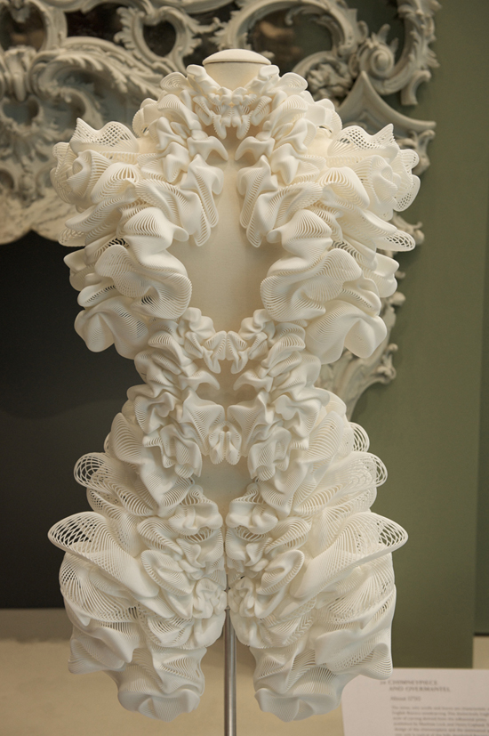
I recently learned about Iris Van Herpen, a Dutch fashion designer who started her own label in 2007. She interned for Alexander McQueen before starting her own line, and her 3D printed dresses were one of TIME's 50 best inventions of 2011:


I watched her Spring 2012 show in Paris and my jaw was on the floor the entire time. This collection is inspired by the work of Canadian architect and artist Philip Beesley, who works around the idea of Hylozoism--the ancient belief that all matter is in some sense alive.

This is my favorite dress from the show:

(photos via femour)

Its structure reminds me of gothic cathedrals (especially the details around the bust) and its color--what makes it hylozoic, I think--reminds of tree bark. So. Freakin. Cool.

Here's another one I liked from the show, it's more literal and just as impressive:
(photos via mkpress)

Van Herpen says this about her work:
"In all my work I try to make clear that fashion is an artistic expression, showing and wearing art, and not just a functional and devoid of content or commercial tool... I intend to show that fashion can certainly have an added value to the world, that it can be timeless and that its consumption can be less important then its beginning."
- Iris Van Herpen
Watch the whole show here:


Saturday, 13 September 2014

True Whit, by Whitney Port

I'm not quite sure who wrote Whitney Port's book, True Whit, because it has no traces of the sensible, charming person I remember from The Hills. The book as a whole is sloppily put together (there are lots of blurry/pixelated photos), and reads like a Seventeen magazine from 2004.

(photo via alamodeappraisal)

And it has nothing to do with the recycled fashion advice. What bothered me most about this book was its lack of depth.

I know, I know. "Grishma, it's a fashion book, are you really expecting depth?!"

Yes. Because unless you go to fashion shows like it's your job and report on them regularly like actual writers at fashion magazines, you're not going to be sharing any advice women haven't already heard. And that's okay! Because what you can offer--what only you can offer--are your stories. Stories about how clothes make you feel, why you like certain styles over others, about what fashion means to you. Don't just tell me that a colorful, patterned skirt goes well with your white blouse. Tell me about why you wanted to stand out at the office party you wore this outfit to. Tell me about how paranoid you were that you'd spill on your white blouse so you only drank clear liquids. Tell me more than just a pairing of clothes.

There are so many fashion books out there, that you have to really know clothes to write a good "how to dress" book. Whitney Port isn't a fashion expert (yet), and I hope that someday she writes a book with a stronger voice.

Until then, here are my top picks for fashion books:

1. Style, by Lauren Conrad: Great advice about choosing and maintaining clothes. She knows what she's talking about.

2. The Truth About Style, by Stacy London: Filled with meaningful stories, this is less of a "how-to" book and more of a "why should you care about clothes" book. She invites 9 women to share their stories (and helps them find clothes they feel confident in), and her empathy and humor is so charming that book was a really enjoyable read.

3. Style, by Kate Spade: The book has ingenious color palettes. I learned that certain colors I wouldn't intuitively combine actually look great together.